Last summer, I started as the Web & Content Strategist for the Virginia Institute of Marine Science (VIMS), part of the College of William & Mary. My first few months were spent on a massive content cleanup across the site, but once that wrapped up, I was able to start on creating new web content. This post features some of the web projects I’ve completed with colleagues during my first six months on the job.
For vims.edu we use Cascade, a CMS built for higher education websites. After previously managing a WordPress website, I appreciate that I don’t have to worry about it crashing out of nowhere or troubleshooting plugin conflicts, but that reliability comes at the cost of limited creative freedom.
In other words, don’t expect any elegant coding or flashy features in these case studies, but I still wanted to share them because they show what real web work in a higher ed setting looks like. In my opinion, constraints don’t diminish creativity: they enhance it.
The VIMS Invertebrate Collection
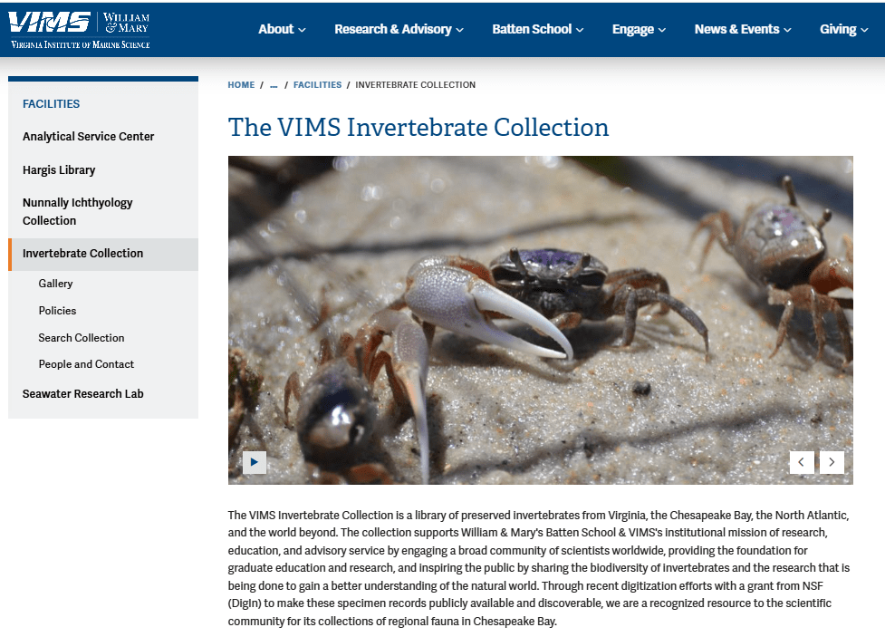
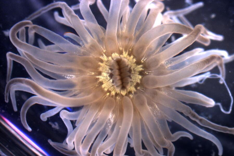
For my first web project for vims.edu, I worked with Jennifer Dreyer, the Invertebrate Collections manager, to create new pages to show off our amazing invertebrate collection.
Jennifer wanted to use the Nunnally Ichthyology Collection’s pages as a template and submitted copy along those lines. She did request one additional element: she wanted some way to share photos she’d taken of the specimens.
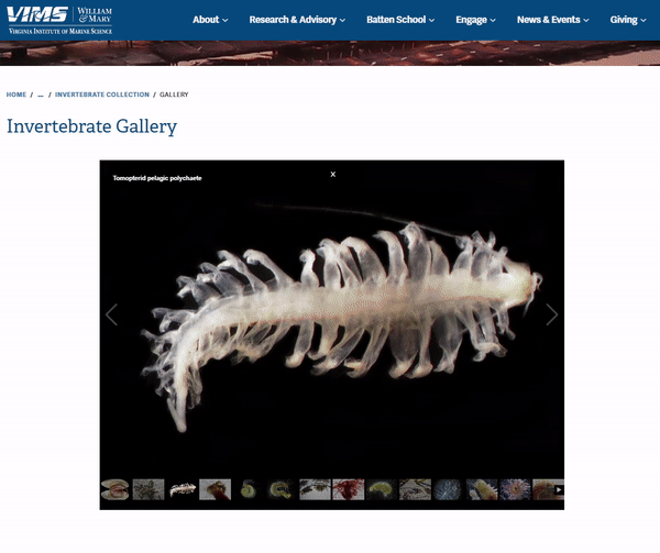
Cascade’s options for displaying images are limited, but I presented her with two options. There is a slideshow template that has a cool zoom and pan effect, but the drawback is the limit on the number of images. The other option is a gallery page where the number of images is essentially unlimited, but it also takes the full width of the page and removes the page menu, hampering navigation – not great for a landing page.
I met with Jennifer to talk about the options, and we decided to use both: the slideshow for the landing page, where the animation could be used to help engage first time visitors, and then create a separate page for the gallery for users who wanted to dig deeper.
My colleagues have already responded positively to these new pages, and I’m eager to see what kind of traction these pages get in the coming months.
For me, this project reinforced the value of being client-first. Jennifer had something she was excited to share, and my job was to figure out the best options and help her do it. The design choices followed from that.
Getting Involved in Marine Science Research
In February, our new Associate Director for Undergraduate Student Success Christine Wlosinski reached out asking to make changes to our web page that goes over options for undergraduates wanting to get involved in coastal and marine sciences research.
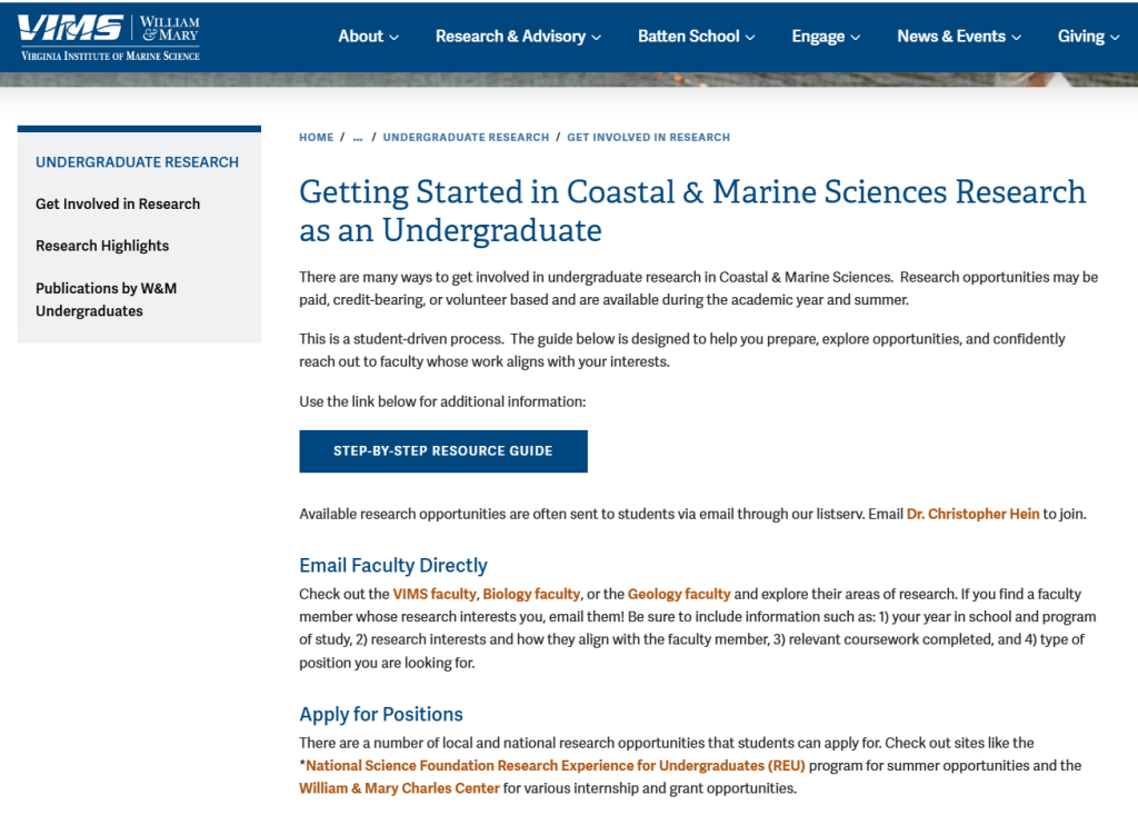
Initially, she wanted my help displaying a visual guide she had created at the top of the page to help undergraduates navigate paths to research. We are currently working on bringing our website up to web accessibility standards, so I had reservations about the text-heavy image. When information is baked into an image, screen readers can’t parse it, and users who need to resize text or adjust contrast are out of luck.
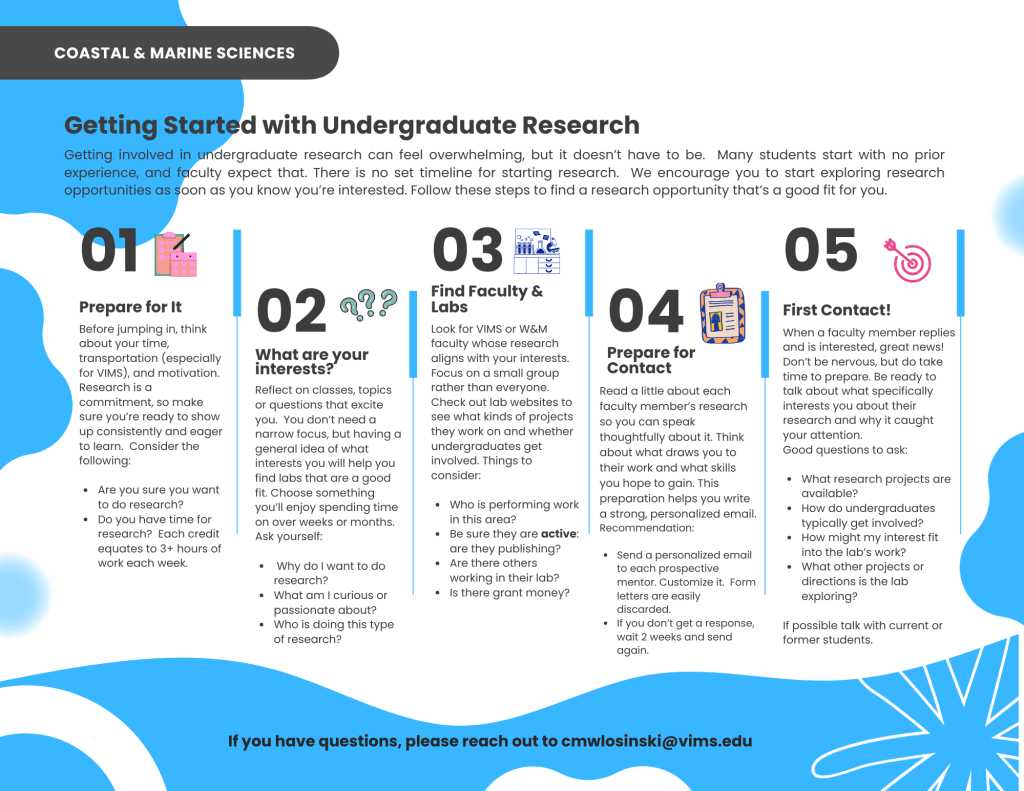
Chris had also proposed adding an accordion list to present essentially the same information that was in the guide, so I suggested we put that list at the top instead with the guide linked at the bottom.
However, as I was building out the page I grew more concerned about the accessibility of the infographic. I told Chris I was leaning towards removing it altogether, but I knew she had worked hard on the visual guide and did think it added value. So, I consulted with W&M Creative, who clarified that as long as all of the same information was on the page, a supplemental graphic was fine.
The compromise we reached turned out really well, and shortly after publishing the pages I received praise from the Director of Undergraduate Programs. It’s these sort of collaborations and navigating the different goals involved that I really enjoy about this work.
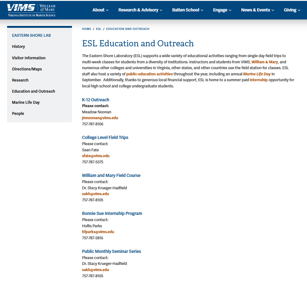
Eastern Shore Lab Education & Outreach
Meadow Noonan, the Outreach and Education Coordinator for our Eastern Shore Laboratory, contacted me in January to see if I could help add some new content to her web pages. She submitted copy with information on their group tours, summer camps, and more but wasn’t sure how to organize it as web content.
When we had our preliminary meeting, I proposed that sub pages be created for their different programs based on audience and that we redesign the landing page to showcase those different programs, making it easier for first time visitors to browse. Meadow cited our main Outreach page on the website as a model to emulate.
Before I had started in this position, I had taken a Nielsen Norman Group Information Architecture workshop that had warned about using audience-based navigation. The instructor had specifically cautioned against this kind of navigation at the top-level of a website, because if a visitor doesn’t immediately identify with any of the options, they don’t know where to go.
In this case, I thought audience-based navigation was acceptable because it wasn’t top-level and ESL’s educational programming is organized around distinct audiences: K-12, college, and the general public.
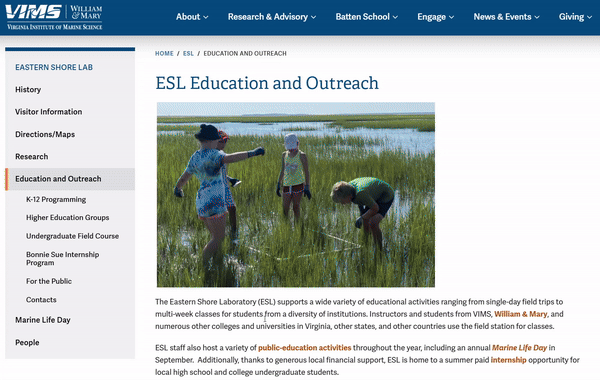
I designed the new landing page based off the top-level Outreach page, adding some navigation buttons at the top which allow users to jump to a specific section based on the audience.
This project was a great example of thinking through the importance of considering who a web page’s audience is and how to accommodate them.
Final Thoughts
In each of these cases, my colleagues had a vision for their pages that didn’t 100% align with my view initially, but through deliberate communication, structured meetings, and active listening, we were able to produce something truly collaborative and engaging to our visitors.
Six months in, the thing that’s struck me most about this work is how much of it comes down to empathizing with my colleagues. The design and technical decisions matter, but they come after understanding what someone is trying to accomplish and their motivations. Then it’s just a matter of figuring out how to get them there within the constraints you’re working with.

Leave a comment